
Cybersecurity Power BI Dashboard
Overview
Before this dashboard, the weekly security briefing was assembled by hand. Reports were downloaded from each tool, pasted into a spreadsheet, and stitched together over a Sunday evening every week. The result captured a slice of program health, some vulnerability numbers, some alert counts, but most of what mattered never made it into the conversation.
Worse, the whole process lived with one person. Miss the prep window because something urgent came up (which happens constantly in security), and leadership walked into the meeting with stale information or no information at all.
I designed and built a single Power BI dashboard that connects to every security tool in the program and refreshes on a schedule. Leadership has a meeting-ready view of security posture in under five minutes, with no spreadsheets and no scavenger hunt.
Goals
- Replace the manual, weekly spreadsheet build with automated refresh
- One pane that covers the full program in one place
- Make it understandable to non-technical leadership without translation
- Surface the data that should be informing decisions, even when it’s harder to pull
- Build it on tools the org already paid for
The Six Pillars
The dashboard is organized around the six areas that matter most in the program. Each gets its own page:
| Pillar | What it answers |
|---|---|
| Overview | Top-line KPIs at a glance for leadership |
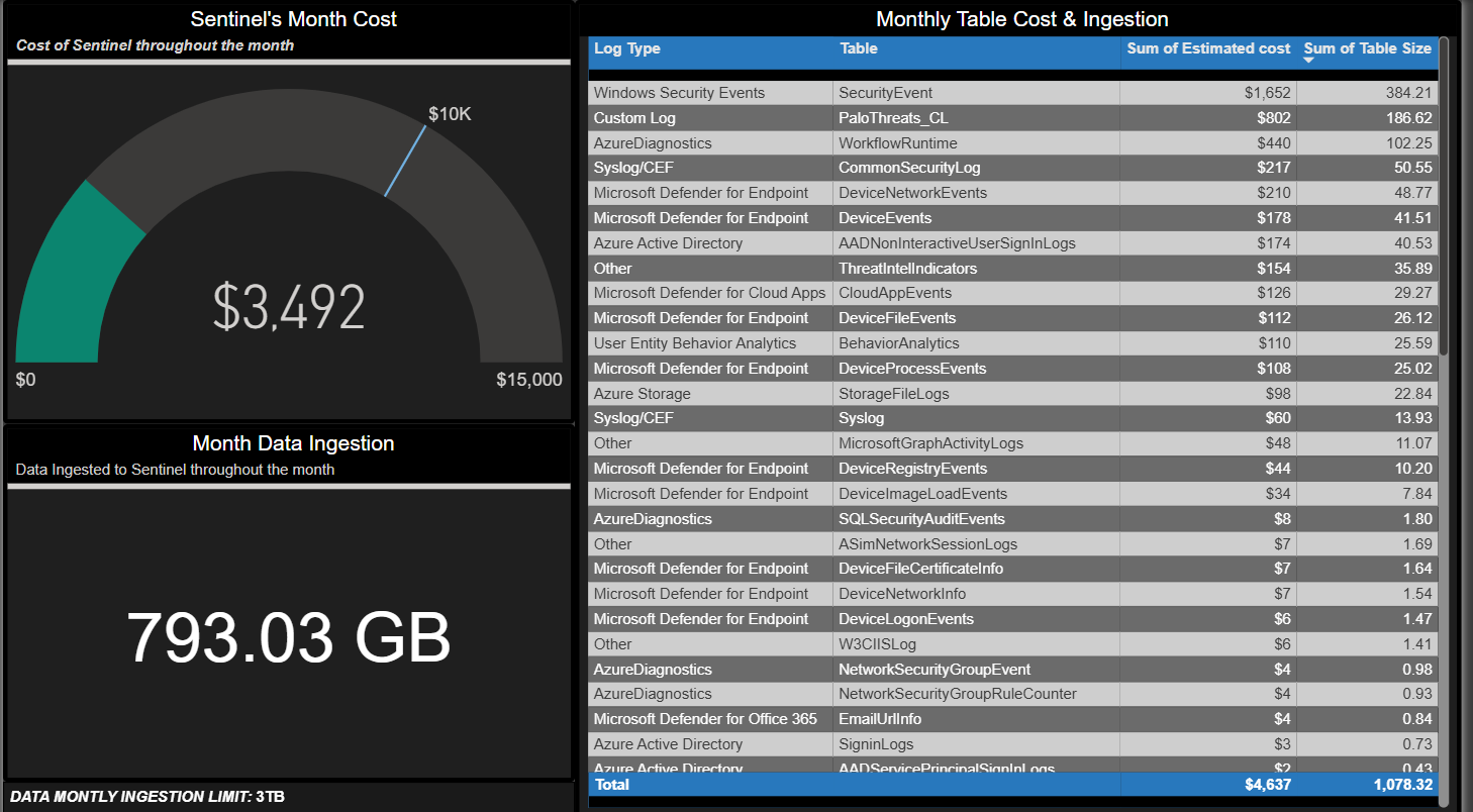
| SIEM Cost Management | What is security monitoring costing us per month? |
| Vulnerability Management | Which systems are at risk and how fast are we fixing them? |
| Incidents & Alerts | What threats are we seeing and how quickly are we resolving them? |
| Email Security | Who’s being targeted and what’s being delivered or blocked? |
| Risk Register | A living record of known risks and current status |
Key Metrics That Drive the Overview
These are the numbers leadership reads first. Each was chosen because it actually moves with program health, not because it was easy to chart.
- MTTR (Mean Time to Remediate): separated by critical and high severity. Trending up means vulnerabilities sit unpatched longer, which widens the attacker window.
- EDR / Antivirus Coverage: the percentage of devices with active endpoint protection. Foundational, and easy to let slip without a dashboard surfacing it.
- New CVEs in the Environment (Last 7 Days): newly discovered known vulnerabilities specifically affecting our assets. Drives weekly patching priorities.
- KnowBe4 Phishing Campaign Results: click-through rates over time on simulated phishing tests. Whether security awareness training is actually working.
Architecture
Each security tool exposes data through APIs. Power BI connects to those APIs, transforms the data, and refreshes on a weekly schedule.
Data sources connected:
- Microsoft Sentinel: the SIEM, pulled via Advanced Hunting API for incidents, alerts, and SIEM cost telemetry
- Microsoft Defender: endpoint vulnerabilities and coverage via the Defender API
- Abnormal Security: email threat protection telemetry
- KnowBe4: phishing campaign results
- SharePoint: the internal Risk Register list
Dashboard Views
Vulnerability Posture
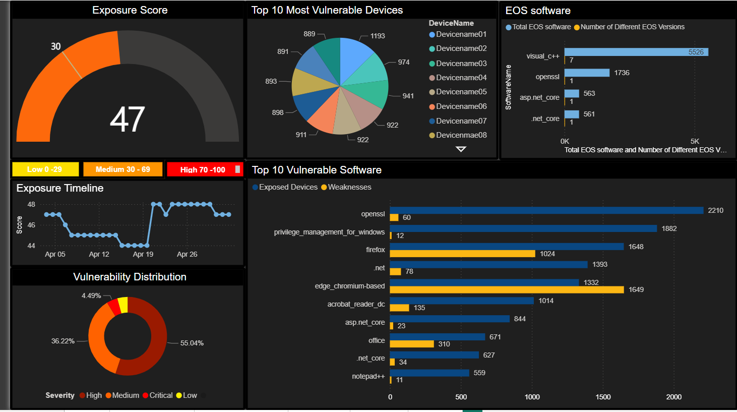 Trend lines on open vulnerabilities by severity, MTTR by criticality, top vulnerable assets, and CVE-level drill-down.
Incidents
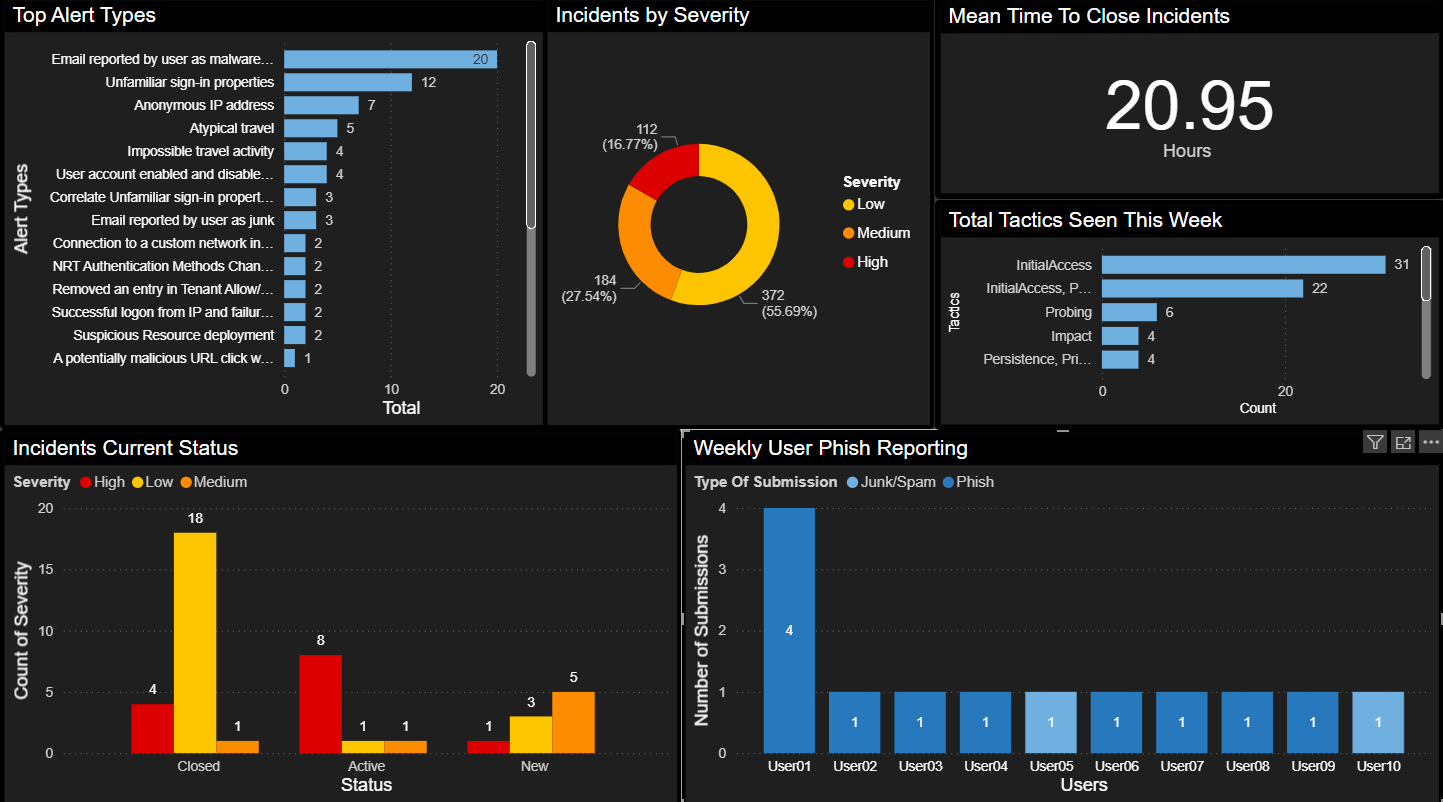 Incident volume by category, MTTR distribution, top alert types, and false-positive rate trending.
Email Security
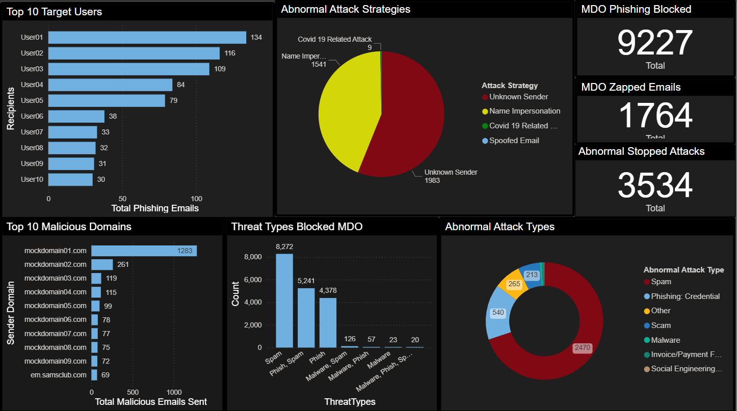 Top targeted users, attack types, blocked vs. delivered ratios, and KnowBe4 simulation outcomes alongside real phishing data.
Outcomes
- One meeting-ready view across six security domains: no more toggling between five tools to answer one question
- Leadership started asking better questions: because they could finally see the data clearly, the conversation shifted from “what happened?” to “why is this trending this way?”
- Coverage gaps surfaced immediately: devices missing endpoint protection that had slipped through manual review
- The risk register became a living document: pulled into the same view as everything else, it stopped being a compliance checkbox and started informing decisions
- Hours recovered every week: the manual prep cycle disappeared
What I’d Do Next
- Anomaly detection on KPI trends so the dashboard surfaces shifts before someone has to notice them
- Embed key views directly into Microsoft Teams for the leadership channel
- Automated weekly commentary, a short narrative that reads the data and writes the story for the briefing